
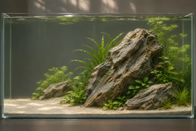
Aquascaping Design Principles: Layout, Balance & Focal Points
Introduction
Aquascaping design becomes easier when you stop asking where every object should go and first decide how you want the whole aquarium to look. Where does your attention begin? Which shapes support that first impression? What space lets the arrangement breathe?
Those questions connect the main aquascaping design principles: focal points, balance, negative space, proportion and visual flow. The rule of thirds and the golden ratio can help you test a layout, but neither can decide whether your aquarium is convincing or practical.
Use the comparisons to try different arrangements before building your aquarium. For the complete setup sequence, begin with our aquascaping guide.
What you’ll learn in this lesson
- How to organize the main masses and choose a focal area.
- How balance differs from symmetry—and why empty space is an active design choice.
- How to use thirds and golden-ratio guides without treating them as compulsory rules.
- How to test a composition before buying more materials or planting the tank.

Separate style, composition and technique
A style describes an approach, such as Nature Aquarium, Dutch or Diorama. Composition describes the arrangement within the frame. A technique is a means of producing an effect: overlapping rocks, grouping contrasting plants or preserving a gap between branches.
These are different levels of decision. A concave composition is not an alternative to a Nature Aquarium; it can be the arrangement used inside one. A winding path is not a complete style. Likewise, adding a golden-ratio overlay to a photograph does not explain the entire design.
Use the aquarium styles guide to choose an overall direction. Use this lesson to organize what occupies the frame. Detailed spatial techniques belong in depth and perspective.
Start with the silhouette of the layout
Reduce the aquarium to two or three large shapes before drawing individual leaves and branches. This makes it easier to see the main decision: where the mass sits and where the opening remains.
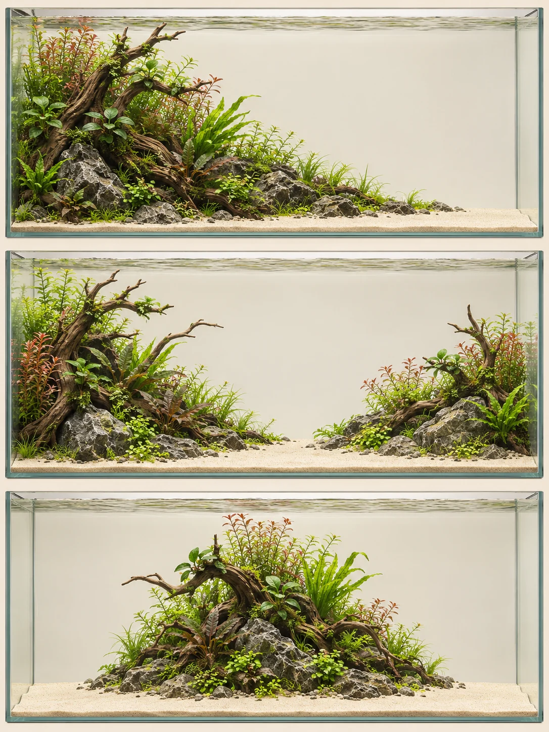
ADA introduces triangular, convex and concave compositions as useful Nature Aquarium starting points. We use them here as a small set of working options, not a complete classification of every possible aquascape. [1]
Triangular: movement from high to low
A triangular composition places a substantial group toward one side and lowers the outline toward the other. It gives you a clear direction to develop with the wood, the planting or both.
Do not make every branch follow precisely the same slope. Start with the overall movement, then introduce smaller variations that remain subordinate to it. The shape should still make sense when the guide line is removed.
For a practical first test, turn a side-view sketch into a simple filled silhouette. If the intended diagonal disappears beneath several competing peaks, decide which peak belongs to the main group and which should be reduced.
Concave: two masses and an opening
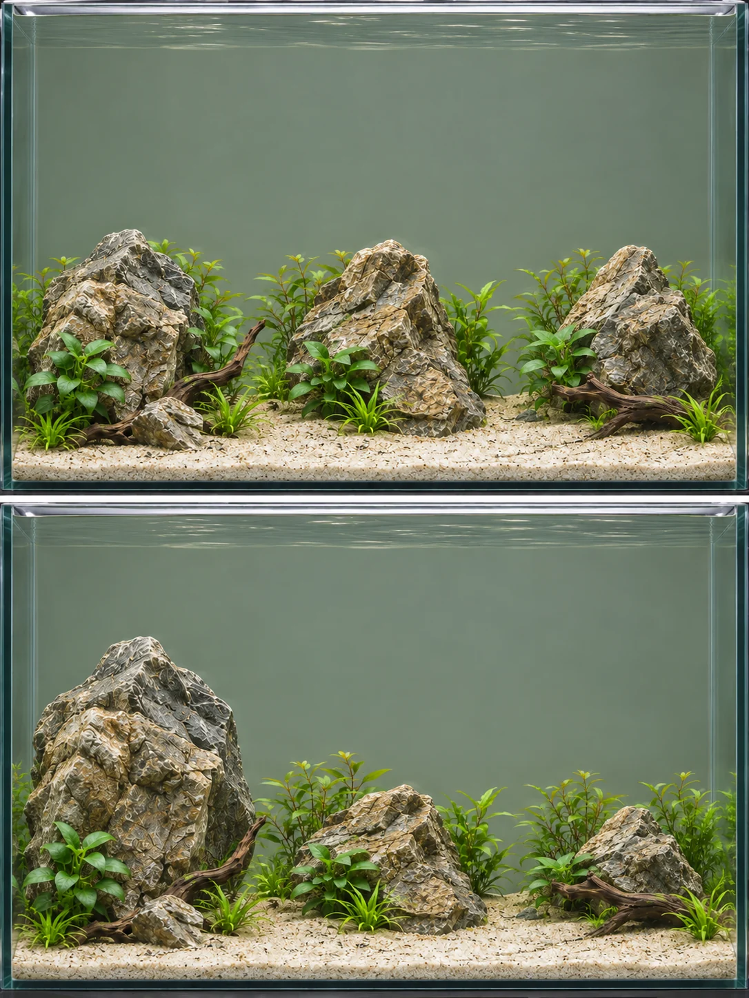
A concave composition uses higher masses at the sides and a lower space between them. The two sides do not have to be identical. A difference in their size or outline can keep the opening from feeling like a perfectly cut doorway.
Ask what the opening reveals. It could expose a planted background, continue as an open route, or simply provide a calm area of water. It does not automatically need a sand path or a distant miniature tree.
Convex or island: a group held within space
An island composition gathers the main structure into a concentrated group with room around it. The outline of the group becomes important because it is easy to read against the surrounding space.
An island can be centered deliberately. Before moving it to satisfy a grid, check whether the centered arrangement is actually working. The more useful questions may concern its silhouette, the amount of space on each side and how the planting will change the outline.


Establish a focal hierarchy
A focal point is where attention gathers. In practice, a focal area is often a more useful term: the eye may settle on the relationship between a branch, a stone and a small plant group rather than on one isolated object.
Begin by naming the primary area in your sketch. Then mark anything else that could compete with it: a bright patch of sand, a strongly colored plant, a sharp peak, an exposed equipment part or a second opening with equal emphasis.
The aim is not to remove all secondary interest. Give the smaller details a role in the overall arrangement. A small, distinctive detail can be important without being the first thing noticed.
Use what you learn in My Aquariums
Follow a new aquarium through cycling or see how water readings and care change over time in an established setup.
A practical focal-point test
View the layout from its intended position, then step farther away or look at a small photograph. Describe what you notice first without naming what you hoped to notice. If the answer is different, change one competing element and compare again.
Ask someone else what they notice first, too. If their attention goes elsewhere, try a small adjustment—such as softening a competing outline—and compare the views.
Do not confuse the main focal area with the tallest point. A low opening beneath wood can carry the design even when the tallest plant stands elsewhere.
Use the rule of thirds as a starting grid
The rule of thirds divides the frame into three equal parts horizontally and vertically. The lines and their intersections provide possible places to test a focal area or a major boundary.
For a front-view sketch 60 cm wide, the vertical thirds are at 20 cm and 40 cm. These are simple divisions of the width, not measurements that every stone must obey. The visible frame may also differ from the tank’s advertised external dimensions.
A useful exercise is to place the main group near one vertical third, then deliberately move it slightly in each direction. Compare the resulting open spaces and the shape of the whole composition. Keep the version that works, even when it no longer sits precisely on the guide.
Understand what the golden ratio actually changes
The golden ratio divides a length so that the ratio of the whole to the larger part equals the ratio of the larger part to the smaller part. The two internal positions are approximately 38.2% and 61.8% of the width, rather than the thirds grid’s 33.3% and 66.7%.
On the same 60 cm sketch, those positions are approximately 22.9 cm and 37.1 cm. The distinction matters when explaining the two systems: a thirds grid and a golden-ratio grid are not the same construction.
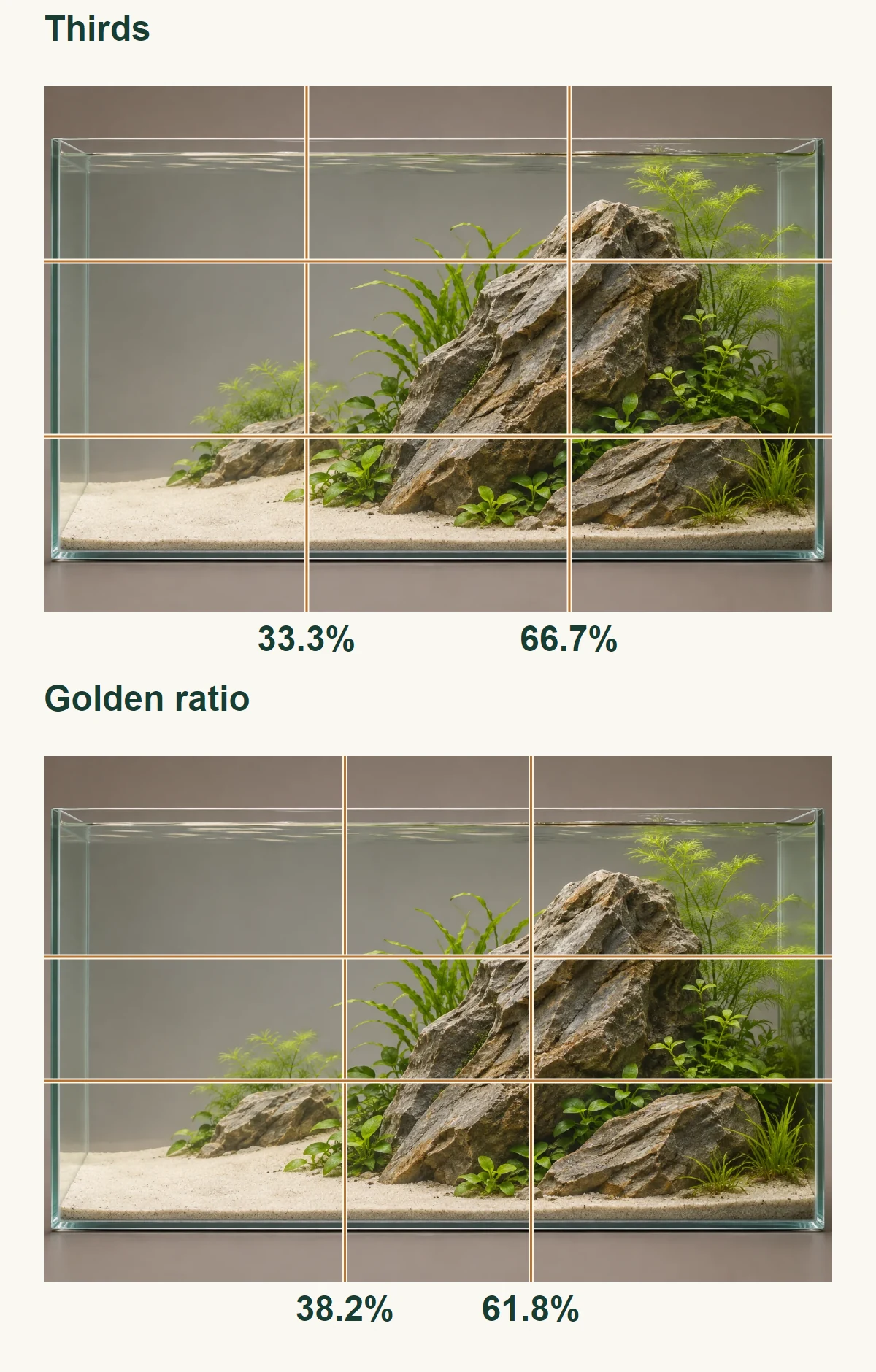
That precision does not imply a more attractive aquarium. Neither a ratio nor a grid accounts for every branch, plant mass, color and maintenance constraint. We recommend trying an overlay only after the main arrangement has a clear purpose.
Golden spirals and golden triangles
A golden spiral is a particular geometric spiral, not any curling line. In composition teaching, spiral and triangular overlays can suggest a route or relationship between elements. They are most useful when they help you make a specific decision you can explain without referring back to the overlay.
A frequent trap is to rotate and resize a guide until it fits an already attractive picture, then claim the guide caused the success. For your own planning, reverse that process: state what you intend to change, make the change and compare the composition without the lines.
Balance does not mean equal objects on both sides
Balance concerns the distribution of visual emphasis. Symmetry concerns mirrored arrangement. They can coincide, but they are not interchangeable.
A large, quiet plant mass can be balanced by a smaller, more distinctive group. Equally sized groups may still compete if their colors, outlines and separation attract attention differently. Judge those relationships from your main viewing position rather than trying to calculate a single balance score.
Try a large group with a smaller supporting group, then compare two groups of similar size. Either can work: asymmetry describes the arrangement, not whether it feels balanced.
Try describing what feels unresolved. Is one side visually empty without a purpose? Are two groups equally dominant? Does an isolated object look unrelated to the rest? Each question suggests a different adjustment.
Design the negative space
Negative space is the area around and between the main forms. In an aquarium it can include open water, visible substrate, an opening behind wood or the gap separating plant groups. It is not limited to bare white sand.
Treat that space as a shape you are designing. Draw its outline in the sketch. Ask whether it connects the composition or merely divides it. Then draw the expected mature planting and see whether the space still exists.
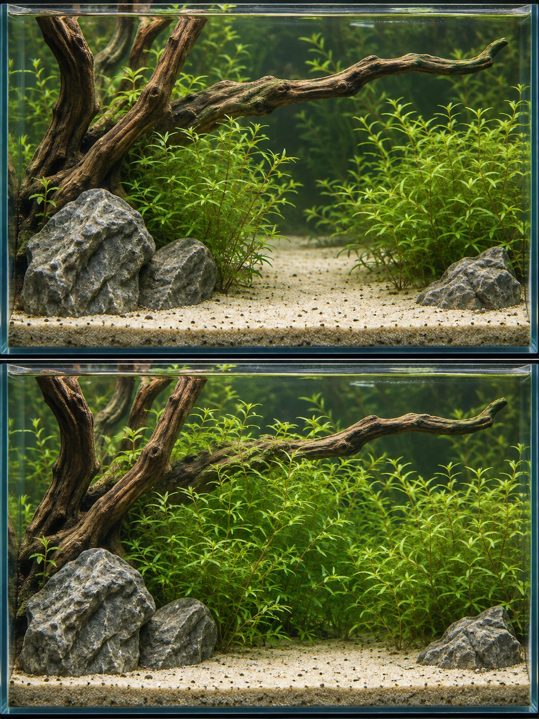
If the design depends on a narrow gap, decide how you will maintain it. A concept that only works immediately after a severe trim may be unsuitable for the aquarium you want to enjoy between maintenance sessions.
Open space also has practical consequences. It may preserve access, create a swimming area or keep a sightline clear. Those functions should be planned deliberately rather than inferred from an attractive drawing.
Give visual flow a purpose
Visual flow is the route you invite the eye to follow. It can come from the direction of branches, a sequence of plant heights, a line of rocks or the edge of an open space.
ADA’s driftwood guidance discusses radial arrangements and the importance of spaces between branches. In a design exercise, that suggests looking at both the lines the wood creates and the openings those lines enclose. [2]
An S-shaped route, for example, should reveal something as it travels through the composition. A winding path that repeatedly disappears behind unrelated masses may read as separate patches rather than one route.
Use named patterns for specific design decisions
Named patterns can help you test different parts of a layout. Use each for the decision it actually helps with:
| Pattern | What it can help you test | What to avoid assuming |
|---|---|---|
| Diagonal, L-shape or pyramid | The main silhouette and concentration of mass | That the outline must follow a perfectly straight guide |
| C-shape, V-shape or circular opening | How a group frames space | That every framed space must become the primary focal point |
| S-curve or double diagonal | Movement across or into the scene | That additional lines automatically produce a stronger composition |
| Radial or tunnel arrangement | How several elements direct attention toward an area | That the layout remains convincing from every viewing position |
| Cross or intersecting guides | A deliberately centered relationship | That central placement is inherently wrong or inherently balanced |
Use a pattern when it helps solve the current arrangement. There is no need to combine several of them simply because the names are available.
Match scale and proportion to the aquarium
Proportion concerns the relationships among the parts and the frame. Scale concerns how large something appears relative to a reference: the tank, another object or the landscape it is intended to suggest.
A single large rock can make a purposeful composition. Several small rocks can produce either coherent detail or scattered clutter. Decide what each piece contributes before treating size alone as the problem.
Plant size complicates this decision. A leaf may be small in botanical terms but visually large beside a miniature “tree.” Choose whether you want a believable miniature landscape or a planted arrangement at its own natural scale. Both can be deliberate goals.
The nano aquascaping lesson applies this question to small footprints. The diorama guide applies it to miniature landscape scenes.
Plan color, texture and mature plant masses together
Before adding a contrasting plant, identify the job it will do. Is it separating two groups, marking the focal area or repeating a color elsewhere? A vivid addition without a role may compete with the feature you wanted to emphasize.
Texture can perform the same job without a large color change. ADA’s “Fine Summer Breeze” example uses a difference in leaf size between neighboring groups to support depth. Try that contrast in your own sketch and check whether it supports the effect you want. [3]
Draw plant groups at their intended maintained size. A stem group that is meant to stay below a wood junction needs an accessible trimming boundary. A carpet that is meant to stop at sand needs a defined edge. Your planting plan should include the shape you want to keep, not only the names you intend to buy.
Use the midground plants lesson and epiphyte guide to find plants that fit your light, CO₂ setup and maintenance routine.
Work through one composition in three passes
Consider a hypothetical front-view sketch of a 60 cm aquarium. The brief is a wood-led layout with an open area to the right. Use the sketch to plan the main shapes and the space they will need as plants grow.
Pass one: establish the mass. Draw the principal wood and planting group toward the left. Give its outer outline a clear direction. Leave the right opening unfilled rather than scattering spare pieces through it.
Pass two: establish the hierarchy. Mark the branch junction you want to emphasize. Add one supporting stone group, then check whether it supports that junction or competes with it. Remove details whose only purpose is to occupy an empty spot.
Pass three: allow for growth and access. Draw the outline of the plant groups around the wood at the size you intend to maintain. Keep the focal junction and the necessary cleaning routes visible. If the intended planting removes the reason you liked the wood, change the planting position before the layout is assembled.
This process is more useful than placing the same branch on an exact grid line and declaring the problem solved. Each pass answers a different question.
Develop an idea without copying the reference
Choose one relationship from a reference: a bank interrupted by an opening, roots following one direction, or a contrast between fine growth and broad leaves. Describe it without naming the original aquarium or listing its exact materials. That short description is a starting brief, not a request to reproduce the photograph.
Sketch two different ways to express the brief in your own dimensions. Compare the main mass, the route through the view and the space needed for planting and care. Keep the version that works with your materials. A visual story can be quiet—a sheltered edge beside open water—without turning every branch into a miniature tree or inventing a dramatic landscape.
Review the design without turning preferences into rules
Photograph the dry arrangement from the intended position. Compare it with the brief, not only with a competition photograph. A monochrome copy can help you compare light and dark groups without the distraction of color.
If the result feels flat, decide whether the problem is the distribution of masses or the view into the tank. This article handles the first question. The depth and perspective lesson handles the second.
If the aquarium already contains established plants and animals, start with the least disruptive change. The aquascaping mistakes guide provides a problem-by-problem approach rather than assume a complete rebuild is necessary.
Conclusion
Give the layout a clear silhouette, a deliberate hierarchy and open spaces that remain useful as the plants develop. Use grids and named composition patterns to test decisions, not to replace judgment.
Before settling on the layout, ask what each choice adds and whether you can maintain it as the plants grow.
💬 Join the Conversation
Which version of your layout are you choosing between? Share the alternatives and the effect you want to achieve in the AquariumLesson Community. A clear design question is more useful than asking whether a tank is simply good or bad.
Frequently asked questions
Are the rule of thirds and the golden ratio the same?
No. Thirds divide the width or height into three equal parts. Golden-ratio divisions sit at approximately 38.2% and 61.8%. They are alternative planning guides, not competing guarantees of visual quality.
Must the focal point be off-center?
No. A centered island, opening or symmetrical arrangement can be intentional. Test whether the surrounding shapes and spaces support it before moving it just to satisfy a guide.
Is an asymmetrical aquascape unbalanced?
Not necessarily. Unequal groups can still create a coherent distribution of emphasis. Their color, shape, texture and position matter alongside their size.
How many plant species should an aquascape contain?
There is no useful universal number for every style and tank. We recommend assigning a role to each group and checking whether the arrangement stays readable and maintainable. A planted garden and a restrained stone composition can require very different choices.
Can I combine several composition patterns?
Yes, but start with one primary organization. Additional curves, diagonals or framing shapes should support that organization rather than create several unrelated design ideas in the same tank.
Lesson completed!
You've finished Aquascaping Design Principles: Layout, Balance & Focal Points. Continue learning or put this guidance into practice.
Continue learning →References
[1] Aqua Design Amano — Nature Aquarium Starting from Zero. Accessed November 2, 2026.
[2] Aqua Design Amano / Yusuke Homma — SUIKEI WORDS 02: Layout composition – Driftwood. Accessed November 2, 2026.
[3] Aqua Design Amano — Nature in the Glass: Fine Summer Breeze. Accessed November 2, 2026.
Aquascape illustrations created with AI; technical diagrams by AquariumLesson.
